• The 10 Most Popular New Laundry Rooms So Far in 2026

    This countdown of the top new laundry rooms uploaded to Houzz so far in 2026 highlights how thoughtful design can elevate one of the home’s hardest-working spaces. Across a range of styles and layouts, these rooms combine smart storage, durable materials and efficient planning with color, pattern and personality. Explore the lineup for ideas on maximizing function while bringing fresh style to wash routines.


    10. Bold, Refined Red

    Cabinetry in a rich, sun-dried tomato red brings bold, tailored energy to this contemporary Houston laundry room by Flair Builders. The space features two sets of washers and dryers to keep loads moving without a bottleneck. On the right, a hardworking island has a generous folding surface and a base fitted with open drawers that double as convenient air-drying racks.


    9. Tailored English Style

    Set in the English town of Camberley, this laundry room by Higham Furniture draws on its pastoral surroundings with a soft, nature-inspired palette. Sage green cabinetry paired with antique brass hardware establishes a classic look, while wicker baskets and hampers introduce layered texture. Stacked appliances free up space for a sink, a drying rod and a practical folding counter, balancing charm with function.

    8. Composed Design Elements

    Pattern, paneling and refined millwork define this transitional Sunnyvale, California, laundry room by Baron Construction and Remodeling. A diamond-patterned floor, tongue-and-groove paneling and thin-rail Shaker-style cabinetry create a composed, tailored look. Function is prioritized with a sink, a drying rod and ample storage.

    7. Relaxed Farmhouse

    The Scandinavian farmhouse-inspired style of this West Bend, Wisconsin, lake house by Highland Builders carries through to the laundry room in the form of patterned wallpaper, a wood countertop and a woven shade. A wall-mounted drying rack tucks neatly against the wall when not in use, and a hamper on casters offers easy mobility throughout the space.

    6. Polished Utility

    Located in a coastal town in New South Wales, Australia, this laundry room by Lynda MacDonald Interior Design delivers kitchen-level polish with slatted navy cabinetry, a crosshatch-patterned gray tile backsplash, warm wood accents and large-format floor tile. The space is equally hardworking, featuring a pullout drying rack that disappears into the cabinetry when not in use, along with a sink, a long drying rod, ample storage and generous counter space.


    5. Big and Bold Botanicals

    Oversize floral wallpaper energizes this Traverse City, Michigan, laundry room by Kitchen Choreography. Hardworking cabinetry handles the utility side of the space with open cubbies for laundry baskets, plus drawers, cabinets and ample countertop and hanging space. An open shelving unit introduces display space for books and decor, helping the room feel as styled as it is functional

    4. Laundry in a Garden

    This Naples, Florida, laundry room by Daso Custom Cabinetry leans into a garden-inspired aesthetic with floral wallpaper, leafy green paint and flower-shaped ceiling lights. The layout is centered around a top-loading washer, with floating shelves above the appliances and a convenient countertop for folding beside them.

    3. Vintage Flair

    Tile wainscoting, leafy wallpaper, brass accents and a patterned Roman shade create a polished, traditional look in this Mercer Island, Washington, laundry room. Q Design Studio layered in high-functioning elements, including a wall-mounted vintage sink, a rolling hamper, abundant cabinetry and a long drying rod.

    2. Stylishly Stacked

    By stacking handsome navy appliances in this Larchmont, New York, laundry room, JWH Design and Cabinetry created space for a drying rod and an L-shaped countertop with an integrated sink. Crisp white cabinets brighten the palette and contrast with the navy appliances, while a warm wood floor grounds the design.

    1. Built for Pets

    This multifunctional entryway in Sacramento, California, serves as a mudroom, laundry room and pet-grooming zone. Design Shop Interiors incorporated a dedicated pet-washing station for easy, ergonomic bathing, while a farmhouse-inspired brick floor stands up to wet paws and everyday use.

  • The 10 Most Popular New Kitchens So Far in 2026

    Whether you’re planning a full remodel or simply gathering ideas for a future update, browsing inspiring kitchens is a great place to start. This countdown of the most-saved new kitchen photos uploaded to Houzz so far this year highlights clever layouts, thoughtful mixes of traditional and modern style, and creative uses of color and texture.


    10. Designed for Family Life

    In this Larchmont, New York, kitchen by JWH Design and Cabinetry, a generously sized white oak island supports casual meals and everyday gathering. Rich navy blue cabinets (Naval by Sherwin-Williams) add personality, balanced by white marble-look quartz countertops and backsplashes that keep the room bright. A matching oak range hood layers in warmth and texture. A nearby butler’s pantry provides extra storage.

    9. Warm Wood Statement

    Richly grained dark wood cabinetry takes center stage in this Philomath, Oregon, kitchen by Neil Richardson Architect, adding character and reflecting the home’s rural surroundings. A restrained palette of white and off-white surfaces balances the bold look. Minimal upper cabinets keep the space feeling open, and counter-to-ceiling tile with an undulating surface catches natural light, adding subtle movement. Warm brass accents, floating wood shelves and brown bar stools reinforce the palette. Taj Mahal quartzite countertops with soft gold veining tie the light and dark elements together.


    8. Hidden Work Zone

    A taller-than-standard island conceals the sink area in this Bloomington, Minnesota, open-plan kitchen, creating a tidy visual buffer and adding generous drawer storage. McDonald Remodeling finished the island in matte green (Dark Olive by Benjamin Moore), echoing the wooded landscape beyond. A lower counter extension forms a casual breakfast bar and defines an efficient work area. A restrained palette of green, terra cotta and natural white oak accents against crisp white walls keeps the space calm and cohesive.


    7. Nature-Inspired Palette

    Sage green cabinetry sets the tone in this Marion, Massachusetts, kitchen by Beige and Bleu Design Studio. The soft matte finish pairs with a natural wood island and richly stained pine beams that echo the surrounding wooded landscape. Woven bar stools and turned island legs introduce subtle craft detail. An antique brass pot filler and gooseneck faucet, a farmhouse sink and Shaker-style cabinetry lend European cottage charm.


    6. Focal Point Range

    The cooking zone takes center stage in this traditional Pennsylvania kitchen by McQueen Building, highlighted by a decorative hood and an off-white marble-look backsplash. Lantern-style antique brass sconces frame the range. Wood and off-white cabinetry against warm white walls (Dover White by Sherwin-Williams) keep the space calm and cohesive. Copper-and-brass pendant lights, traditional hardware and richly stained plank flooring layer in warmth and timeless character.


    5. Clever Storage

    Storage is cleverly maximized in this San Francisco kitchen by Baron Construction and Remodeling without crowding the space. Slim gaps beside and above the refrigerator hold baking sheets, cutting boards and serving pieces. Cabinets along the back of the island add extra capacity. A pantry and laundry area behind the range wall provides additional storage, keeping the island and cooking zone calm and uncluttered. A white oak island and wide-plank flooring reinforce the warm, layered feel.


    4. Layered Elegance

    Large cabinets in this Austin, Texas, kitchen by Urbane Design feel substantial without overwhelming, thanks to narrow frames, fine-grain doors, slim brass handles and gently curved crown moldings. Pendant lights are sized to anchor the space without dominating, and black island doors recede and let the warm wood cabinetry shine. White quartz countertops and backsplashes, paired with a simple white range hood, break up the wood and keep the room bright and airy.


    3. Bold Blue Cabinets

    Benjamin Moore’s Hale Navy cabinets anchor this Hooksett, New Hampshire, kitchen by Granite State Cabinetry. It’s balanced by a glass-fronted unit, pale gray tile surrounding the sink window and white marble-look quartz countertops and backsplash. A custom metal hood in smoky gray and deep bronze echoes the quartz tones. A large walnut-stained island under starburst pendant lights provides a perfect spot for prepping and entertaining.


    2. Modern Farmhouse Style

    Clean-lined white and plain-sawn white oak cabinetry anchors this Milwaukee kitchen by Highland Builders, paired with off-white marble-look countertops. Farmhouse touches — a tongue-and-groove range hood, textured tile, a gooseneck faucet and vintage bell jar pendant lights — add character. The classic wood-and-white palette keeps the space fresh and open. Clever storage solutions help make this a highly functional kitchen.


    1. Texture and Tone

    Layered textures keep this all-white San Clemente, California, kitchen by Pure Salt Interiors warm and inviting. Shaker cabinets with brass handles include glazed upper cupboards for glassware. Undulating zellige wall tile and subtly veined countertops add depth. Natural materials — woven rattan pendant lights, linen-and-wood bar chairs, richly grained wood floors and warm metal faucets and accessories — introduce character and a lived-in feel.

  • The 10 Most Popular New Laundry Rooms Right Now

    This countdown of the 10 most-saved new laundry rooms on Houzz shows that even the most functional spaces can be stylish and uplifting. Check out the clever layouts, soothing colors and smart storage for thoughtful design ideas on turning a chore into a moment of calm and satisfaction.


    10. Neat Nook

    Nestled into an alcove, this laundry area saves space without sacrificing utility or good looks. Design firm Paige Lee Interiors in Michigan set a countertop across the top of the units so it can hold baskets or be a base for folding clothes. A rod for air drying is tucked between two cabinets, which are closed to keep detergents and other items out of sight. An open shelf allows for decor, while a patterned floor with a bit of blue injects energy into the crisp black-and-white palette.


    9. Tasteful Traditional

    Glossy white brick set at slightly varying depths manages to look both old-world and completely fresh in this traditional laundry room in the Washington, D.C., area. Loial Home also went “updated traditional” with the dark star-and-cross tile flooring. As for practical features, the space includes a drying rod, a generous counter with rolling baskets underneath and plenty of closed storage. And anyone doing hand-washing in the sink won’t feel closed in, thanks to a nearby window with a view of greenery.


    8. View Master

    Katie Severns Design used woven cabinet fronts and glossy handmade-looking tile with subtle variations to give this San Francisco laundry room organic flair. But the clean lines, unobtrusive hardware and neutral palette convey a modern sensibility too. Copious cabinets keep unsightly elements off the spacious countertop. Note how the black washer and dryer draw the eye toward the black-frame door and its outdoor view instead of toward the room’s workaday interior. A rug helps pick up any dirt that might make its way in from the outside world.


    7. Row With the Flow

    Stacking the washer and dryer in this narrow laundry room allowed Sustainable Nine Design + Build to pack in a shelving unit along the side. The space, in a Minneapolis row house, also has closed upper and lower cabinets and baskets perched on an open shelf, to give every product a tucked-away place. A drying rod and sink round out the convenience features, while the palette relies on soft neutrals for ease on the eyes. As in the previous example, however, a striking black window frame cleverly pulls the gaze outdoors.


    6. Checking All the Boxes

    Grid-style lines help break up the plentiful white cabinetry in this New South Wales, Australia, laundry room by Horton & Co., but just enough to create interest and not interrupt any chore-time daydreaming. The flooring design has boxes of its own and contributes grounding stone-like colors, while small wall tiles in various beige and brown tones add a complementary touch and give the eye another place to land. A drying rod, a spacious countertop and open shelves with decor complete the picture.


    5. Glow for It

    Soft gray cabinetry and wall tile in varying shades of cream and beige give this Dallas laundry room by Jessica Koltun Home a soothing yet uplifting feel. Even the checkerboard floor is toned down from the traditional crisp black-and-white version. Washed in natural light, the space almost seems to glow from within. Gold-tone cup pulls and knobs add polish and shine, while an apron-front sink and its polished vintage-style faucet bring both a countrified feel and an aura of refinement.


    4. Purple Reign

    Eschewing a light and airy color palette in favor of deep purple cabinets, walls and millwork, April Gahagan of FS Design Group gave this laundry area a rich, layered look. Because the space, brought to life by Judd Builders in North Carolina, also serves as a side foyer, mudroom and pantry — a high-traffic area, in other words — the designer carefully balanced aesthetics with practicality. For instance, dragonfly wallpaper has been placed higher up, above sturdier wainscoting, to keep it out of harm’s way. And the flooring is durable brick, given an elevated look thanks to varying shades and a herringbone pattern.


    3. Cottage Chic

    Thoughtful storage meets farmhouse freshness in this Georgia laundry room. The space was designed by Megan Bolz of MB Designs and built by MDH Design & Build, which uses Houzz Pro to manage its business. The room has drawers conveniently placed next to the stacked washer and dryer, cabinets for detergent jugs and other large items, and a tall cabinet with an outlet for keeping cleaning appliances at the ready. Baskets under the counter can keep lights and darks or dirty and clean clothes separate. An extra-long sink offers plenty of room for soaking and rinsing. And the whole space is drenched in a soothing creamy white with a few contrasting elements for interest.


    2. Hardworking Hub

    The pretty blue-gray cabinet color and fun travel-celebrating wallpaper might catch the eye first, but Surrina Plemons Interiors and Laurel McAteer of Studio Haven Interiors incorporated more than immediately meets the eye in this basement-level San Francisco Bay Area laundry room. A laundry chute is hiding in those tall cabinets on the right, a full-size refrigerator and freezer (not seen) sit to the left of the sink, and a wine fridge has a home next to the sink.


    1. Natural Beauty

    Earthy green cabinets (Evergreen Fog by Sherwin-Williams) bring nature into this North Carolina laundry room by Susanne Ordonez of House of Maevie. But the space is far from untamed, with elegant hardware, beadboard-clad walls and white oak open shelves holding artwork and accoutrements. A built-in hamper offers convenience, while a stool can double as a waist-high basket perch or a place for resting between cycles.


  • The 10 Most Popular New Bedrooms So Far in 2026

    A cozy, calming bedroom designed for relaxation is a goal many homeowners share, and these inspiring spaces offer plenty of ideas for achieving it. Thoughtful layering of color and texture, well-scaled furniture and soothing details help shape rooms that feel restful and inviting. Discover how designers are creating serene retreats in this countdown of the most-saved bedroom photos uploaded to Houzz so far this year.

    10. Warm Earth Tones

    In this New Orleans bedroom by Susan Currie Design, terra-cotta accents enrich a pale neutral palette and create a cozy, inviting space. Throw pillows and a matching blanket highlight the bed and window seat. Japanese-inspired motifs appear throughout, including painterly paddle fans on the Roman shade, turtle-shaped lamp bases symbolizing longevity, and artwork depicting cranes associated with peace. Dark wood furniture and antique brass accessories deepen the color scheme, and open shelving filled with books adds texture and a lived-in feel.

    9. Coastal Layers

    Gray-green painterly wallpaper defines this Charleston, South Carolina, coastal home by Michael Mitchell, replacing classic seaside motifs with a more atmospheric approach. The wave-like pattern forms a soothing backdrop for off-whites and pale grays. Layered textiles provide visual interest, including throw pillows, a shell-inspired lamp, a rattan bench and a soft gray carpet. Linen bedding, window treatments and upholstered seating with subtle woven details enhance the overall warmth of the space.

    8. Textured Elegance

    Rich neutrals and plush finishes define this Springfield, Missouri, primary suite by Obelisk Home, converted from a former garage. Brown tones — chocolate, caramel and creamy latte — introduce depth while keeping the palette cohesive. Velvet upholstery on the bed and tufted armchairs softens the room, set against grasscloth wallcoverings and a walnut floor. An antique brass canopy bed and coordinating chandelier introduce a metallic glow that complements the lofty ceiling.

    7. Ocean-Toned Escape

    A sea green tray ceiling creates a restorative setting in this Fremont, California, bedroom designed by Raashi Design, which uses Houzz Pro software. Blue-green hues define the space, layered with soft fabrics. A reading corner features an upholstered chaise lounge and task lighting. A dressing area with custom stationary drapery panels adds function. Venetian blinds control light and privacy, and darker blue accents on the bed and chaise delineate key areas within the color scheme.

    6. Natural Comfort

    A fireplace anchors this transitional Minneapolis bedroom by Eminent Interior Design, paired with a boucle wool bench and upholstered armchair. Pale gray stone, a wood-beamed ceiling and beige seagrass wallpaper introduce texture. A thick area rug softens the wide-plank flooring. A plush bed throw and pillows enhance coziness, completing the welcoming, lived-in feel.

    5. Organic Inspiration

    Nature-inspired colors set the tone in this Nebo, North Carolina, bedroom by CBB Design Firm, which uses Houzz Pro. Mirrors flanking the bed, inset into custom paneling painted Iron Ore by Sherwin-Williams, reflect the surrounding lake views and amplify daylight. Natural wood in the bed, nightstands, latticed ceiling beams and white oak flooring reinforces the earthy palette. Soft bedding, seating and an area rug invite lingering in the scenic, peaceful setting.

    4. Sculptural Details

    Deep Tricorn Black paint and fitted crown molding create a dramatic backdrop in this Winnetka, Illinois, primary bedroom by Lugbill Designs. Fluted wall panels behind the bed introduce dimension, echoed by ripplefold drapery, a stitched bench and a striped area rug. A tall, deep-blue headboard commands attention, balanced by opal bedside pendant lights that provide sculptural interest without competing with the centerpiece bed.

    3. Light-Filled Serenity

    Daylight and pale finishes define this Boston bedroom by Nina Kierulf Interior Design, creating a tranquil, nature-inspired space. Leafy artwork above the bed references the surrounding trees, while a floral area rug evokes a cottage garden. Natural wood frames the bed and artwork, complemented by wallpaper with a subtle wood grain pattern. Pale gold foliage motifs on the duvet and pillows establish the bed as the room’s inviting focal point.

    2. Restful Retreat

    Warm off-white and cappuccino tones define this Denver primary bedroom remodeled by Perspective Design Build. Rich wood beams, bed frame, nightstands, armchairs and flooring provide structure and visual cohesion. Decorative touches — including a chandelier, mirrored candle sconce and nailhead trim — introduce subtle interest without overwhelming the neutral palette. The original archway frames an intimate seating area, where a potted tree softens the transition to the leafy landscape outside.

    1. Farmhouse Tranquillity

    Clean lines and traditional details shape this Granite Bay, California, transitional bedroom by Design Shop Interiors. A tall, 72-inch natural-linen-upholstered bed complements the high ceiling. Tongue-and-groove wall paneling adds visual interest and nods to the rural setting. Vintage furnishings bring character and a sense of history. Layered earthy neutrals, floral prints and fabrics such as linen and velvet complete the welcoming, comfortable environment.

  • The 10 Most Popular New Kitchens So Far

    White-and-wood kitchen palettes have been extremely popular for years. But you’ll find fresh ideas for creating the classic combination in this countdown of the most-saved new kitchen photos uploaded to Houzz so far this year. You’ll also find neat storage ideas, creative island designs and more inspiring features and details worth saving to your own ideabooks.


    1. Arches and Texture

    This Dallas kitchen by Le Belle Maison Interiors beautifully combines many of the design elements renovating homeowners are asking for today — and many featured in other photos in this countdown. They include a white-and-wood palette, a large island for entertaining and paneled appliances. A couple of other trending details to note in this kitchen are the zellige backsplash tiles and the arched doorway, the latter of which is echoed by the arched counter stool backs and dome-shaped island pendant lights.


    2. Simply Marbleous

    Remodeled by Broad Oaks Construction, this San Francisco kitchen features white upper cabinets paired with rift white oak lower cabinets with a clear stain. The two tones are bridged by a countertop and backsplash of Calacatta Paonazzo marble, which is prized for its bold golden, black and sometimes plum-colored veining. The back of the island has a reeded detail for extra visual interest and texture.


    3. Bit of Bling

    This Princeton, New Jersey, kitchen remodeled by The Home X has a limited palette of light wood, crisp white and shades of gray. But it’s full of luxe details. For example, an intricate backsplash composed of tiny tiles in a herringbone pattern stretches countertop to ceiling. Furniture-like legs support the island overhang. And delicate, cage-like chandeliers add opulent gold counterpoints to the cooler-toned and earthier elements.


    4. European Elegance

    Patrick and Meghan Sharp of Mister + Mrs Sharp and builder John Bynum created this sophisticated Atlanta kitchen, which has white oak cabinetry with a medium brown stain, glazed white terra-cotta backsplash tiles and a marble-look quartz countertop. Behind the range top, the quartz swoops up with a graceful curve to meet a European-style range hood supported by corbels. Additional regal accents include the counter stools’ velvety upholstery and burnished brass accents such as the double gooseneck spout faucet and pot filler.


    5. Window Dressing

    Reeded glass-front accent cabinets extend from countertop to ceiling in this rich wood-toned Philadelphia kitchen by Bella B Home Designs. Lights inside the cabinets illuminate the dishware and enhance the reed detail, while modern torch-like sconces draw attention to the gold-and-black detail on the shapely range hood and the dramatic veining in the stone backsplash.


    6. Spring Mix

    Filled with compelling contrasts and special details, this Orange County, California, kitchen was designed by Alicia Torosian, who uses Houzz Pro business software to manage her projects. Torosian paired earthy green cabinets with white quartzite countertops around the kitchen’s perimeter, extending the quartzite partway up the range wall. Above the quartzite, a thin whitewashed-brick backsplash runs up to the vaulted shiplap-covered ceiling. At the center of the room, a dark wood island has a black granite countertop embellished with an ogee edge.


    7. Architectural Intrigue

    A barrel ceiling with rich walnut paneling and cove lighting is a showstopper in this Sherwood, Oregon, kitchen. Created by Holly Moore, Stacey Miller and Matt McQueen of Lifetime Remodeling Systems, the kitchen also has a large arched window and a smaller circular window that give the room a unique look and frame the spectacular wooded views. The walnut ceiling detail coordinates with the window trim, walnut cabinetry and detail on the decorative range hood.


    8. Subtle Style

    The slatted detail on the range hood is a subtle, on-trend addition to this Los Angeles kitchen by general contracting firm New Vision Builders. Warm wood cabinets, paneled appliances and a shared countertop and backsplash material contribute to the room’s pared-back — but not plain — look.


    9. Herringbone and Hexagons

    A herringbone-pattern wood floor and hex-pattern backsplash add texture and geometric pattern to this white-and-wood Los Altos, California, kitchen by KNR Design Studio and Changras & Frey Construction. Sunshine pouring into the room through the skylight accentuates the backsplash tiles’ shape and sheen.


    10. Step on Up

    This Portland, Oregon, kitchen by Guggenheim Architecture + Design Studio has appealing clean lines, mixed wood tones, midcentury-modern-style elements, skinny Shaker cabinet fronts and rounded island corners. But a detail that makes it especially popular is the handy folding step stool, which fits into a narrow gap between cabinets.

  • 5 Stylish New Bathrooms With a Shower-Tub Combo

    A shower-tub combo may not sound glamorous, but it remains one of the most practical features a home can have. Many homeowners choose to keep at least one tub for bathing young children, accommodating different needs over time or appealing to a wider range of future buyers. A combo setup delivers both a tub and a shower in one compact footprint. Here, design and remodeling pros share how they’ve elevated this hardworking feature with thoughtful planning and stylish details.


    1. Cheerful Classic Revival

    Designer: Will Fryer
    ​​​​Location: Brooklyn, New York
    Size: 80 square feet (7.4 square meters)

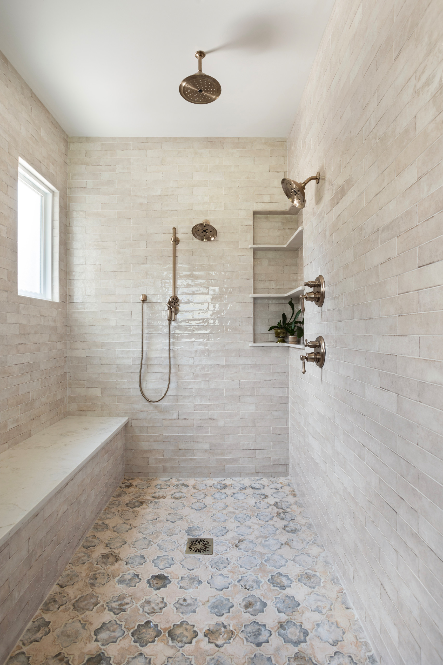
    ​​​​Homeowners’ request. “This brownstone had previously been divided into four apartments, and we recombined the upper three floors, leaving the garden level separate,” says interior designer Will Fryer. “We also added an extension to the rear of the house, providing approximately 300 additional square feet. Our goal was to update the house for modern needs and convenience while retaining the low-key classical motifs of the original design. The clients are laid-back, with an affinity for traditional English houses, so the design reflects a relaxed traditionalism that is classic and inviting.”

    ​​Shower-tub combo. “We designed this bathroom for future children, so we knew we needed a shower-tub combo and a bright and cheerful mood,” Fryer says. “The client fell in love with a sage green herringbone mosaic tile, so we color-matched the wall and paired it with a classic Carrara marble on the tub deck and niche, which helps tie this space in with the character of the house.”
    ​​
    ​​Other special features. “The polished nickel fittings look lovely against the pale green walls and tile,” Fryer says. “The floor is very plain, but it’s a good backdrop for the white oak vanity.”

    ​​​​Designer tip. “Using stone on the window jambs and sill makes the space feel luxuriously tailored,” Fryer says.
    ​​
    Wall tile: Glazed herringbone mosaic in Jadite, Nemo Tile + Stone; vanity: Berkeley in white oak, Room & Board; wall paint: Healing Aloe, Benjamin Moore


    2. Versatile and Timeless

    Designer: Jessica Nelson Design
    Location: Seattle
    Size: 67 square feet (6.2 square meters); 6½ by 10⅓ feet

    Homeowners’ request. “This bathroom was designed to function for two young boys as well as a future guest bathroom, so our clients wanted a design that was versatile — one that didn’t lean too youthful or boyish and could eventually be comfortable for guests,” says interior designer Jessica Nelson.

    Shower-tub combo. “We wanted to keep the shower-tub combo because it was versatile and saved space,” Nelson says. “We chose a muted green subway tile for the shower-tub surround to add some subtle, calming color to the space. We also chose materials that were easy to wipe down clean.”

    Other special features. “My favorite feature of this bathroom is the laundry chute,” Nelson says. “It was originally on the wall, so we had to work our space planning around it. We ended up creating a vanity with a middle cabinet that connected to the chute, so it’s incredibly functional but blends right in. The home is a Dutch Colonial style, so we chose a checkered pattern floor and unlacquered brass fixtures since they were timeless and architecturally appropriate. The walls are Benjamin Moore White Dove and the vanity is Farrow & Ball Card Room Green. We also chose a tongue-and-groove paneling on the walls to add texture while still being wipeable. It makes the space feel a little more special.”

    Designer tip. “Tongue-and-groove paneling is a great way to add texture to a room, especially if you have interesting architectural details like a sloped ceiling,” Nelson says.

    “Uh-oh” moment. “The sloped ceiling was certainly a challenge,” Nelson says. “Hanging those pendants on a slope definitely kept me up at night. I was worried our clients might hit their head or the height wouldn’t be quite right, but they worked out great. And trying to find a shower curtain rod that could mount on an angled wall was tricky.”


    3. Warm and Textural

    Designer: EOS Architecture
    General contractor: GDC Construction
    Location: La Jolla, California
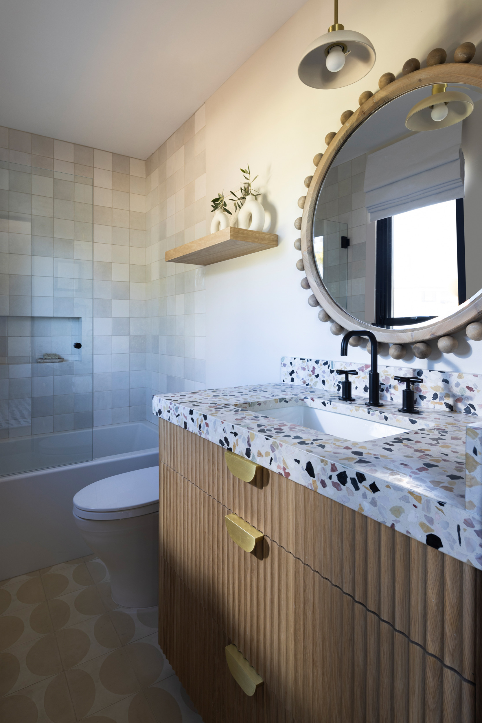
    Size: 43 square feet (4 square meters); 5 by 8½ feet

    Homeowners’ request. “The homeowner wanted a modern, youthful and highly functional bathroom that felt bright, fresh and custom,” says contractor Pancho Dewhurst. “They wanted to replace a dated and basic bath with elevated finishes, playful texture and unique details while still keeping a warm and welcoming tone. One challenge we faced was the desire to balance neutral calm tones with a colorful personality. The solution was combining warm wood tones, playful terrazzo and soft neutral tile variations to create depth and interest.”

    Shower-tub combo. “The decision to keep the shower-tub combo was for functionality for family or guests while maximizing a compact layout,” Dewhurst says. “The designer chose soft tonal square tile in a gradient of warm beige and ivory hues, creating visual texture without overwhelming the room. A built-in niche and minimal black hardware elevate the modern aesthetic.”

    Other special features. “A terrazzo countertop and backsplash with multicolor chips brings energy and contrast,” Dewhurst says. “A fluted natural white oak vanity adds warmth and organic texture. The brushed brass drawer pulls introduce modern elegance and contrast. A found wood-framed mirror with sculptural beading creates a standout focal feature. A matte black faucet and matching shower fixtures add definition. A floating wood shelf adds display and storage. Warm neutral patterned floor tile complements the terrazzo and wall tile.”

    Contractor tip. “Mixing subtle neutral tones with one bold statement material allows personality without overwhelming a small space,” Dewhurst says. “Texture is just as important as color when designing a visually rich but calm bathroom.”

    “Uh-oh” moment. “The oversized patterned terrazzo slab and fluted vanity detail required precise coordination so the drawers cleared hardware and plumbing without interfering with the sink and slab thickness,” Dewhurst says. “Template accuracy and careful installation ensured the lines remained clean and functional.”


    4. Earthy With Edge

    Designers: Chanet Smith and Michelle Shaver of MIC & NAY | Design Collective
    Location: Las Vegas
    Size: 60 square feet (5.6 square meters)

    Homeowner’s request. “This project was a full remodel of a 1970s home,” says interior designer Chanet Smith. “The layout of the house itself did not work for the client. We restructured the laundry room, son’s closet and bathroom to create an ‘east wing’ for his son. The overall idea for his son’s room was a western-cowboy theme. He wanted deep blues but something still timeless enough for his son to be able to use the bathroom into his teen years.”

    Shower-tub combo. “Because his son is a toddler, he still needed to have a tub in the house,” Smith says. “We chose tile that would age well in terms of maturity and timelessness. The tambour blonde slatted wood tile feels very earthy and minimal.”

    Other special features. White oak cabinets. Dark blue walls (Gale Force by Sherwin-Williams). Brushed nickel plumbing.

    Designer tip. “To elevate this shower-tub combo, we used a drop-in tub with a quartz top,” Smith says. “This tends to look more custom and provide more surface space around the tub. It also allows the ability to tile the side of the tub, looking much more custom than an alcove tub.”

    “Uh-oh” moment. “We came across a budget constraint where the client did not want to tile the entire vanity wall,” Smith says. “We wanted the space to look large and seamless, so we made the decision to paint-match the tile and paint the entire vanity wall. We also built a short backsplash with the blue square tiles we used on the plumbing wall of the shower.”


    5. Designed for Three

    Designer: Victoria Johnson of M. Victoria Johnson Interiors
    Location: Maple Grove, Minnesota
    Size: 50 square feet (4.7 square meters)

    Homeowners’ request. “This bathroom is shared by three teenage girls,” says interior designer Victoria Johnson. “The parents reached out wanting to maximize storage and give the space a more elevated, timeless look.”

    Shower-tub combo. “The homeowners chose to keep the shower-tub combo primarily for resale value, as families with young children often prefer having a tub,” Johnson says. “Plus, their teenage daughters still enjoy using it. To make the setup more functional, we designed a wall-to-wall niche large enough to hold all their hair products, soaps and razors neatly. We also added a hand shower, which serves both as a spa-like feature and a practical one — it’s perfect for washing their beloved dog.”

    Other special features. “Everything in this bathroom was designed around the idea of three — one for each daughter,” Johnson says. “We installed a triple medicine cabinet, which we purchased on Houzz, so each girl has her own section. We also designed a custom recessed cabinet between the studs, again divided into three compartments for individual storage. The custom vanity features a single sink to maximize counter space, a decision that has proven incredibly functional for busy mornings.” The countertop is Taj Mahal quartzite.

    Designer tip. “There are three features I absolutely love here,” Johnson says. “First, the wall-to-wall niche. It’s such a simple upgrade that dramatically improves usability, and I’ll likely do this in every project moving forward. Second, medicine cabinets. There are so many beautifully designed options now and the hidden storage they provide is invaluable. Third, when space is tight, adding recessed cabinets between studs is a clever way to gain storage without sacrificing floor space.”


  • Kitchen of the Week: A Cottage Kitchen Opens Up

    Kitchen at a Glance
    Who lives here: David Brown, a software engineer who loves to cook and have his family over for dinner
    Location: Sykesville, Maryland
    Size: 230 square feet (21 square meters); 17 feet by 13½ feet
    Designer: Andrea Lynn Orndorff of A. Lynn Design

    Before its remodel, the kitchen in David Brown’s 1910 cottage in Sykesville, Maryland, had gone for decades without updates. It had little counter space and storage, and the dark paneling and limited light made it dim no matter the time of day. Brown is up on all things tech and wanted modern upgrades and a lighter, more open kitchen, but he appreciated his home’s age and wanted his remodel to honor it.

    “When David first came to me with ideas for his new kitchen design, he was considering stained cherry cabinets,” interior designer Andrea Lynn Orndorff says. But after seeing the photos he had saved to his Houzz ideabook, it was clear he wanted a white kitchen.

    “My goal was to keep the overall look light, bright and fresh with white cabinetry and light walls, while also pulling in some warmer elements and adding texture via the material choices,” Orndorff says. “It was important that the new kitchen not feel too modern, so David and I worked together to create an updated space in keeping with the feel of the house.”


    A Small Island Replaces the Peninsula

    Orndorff suggested removing the peninsula that separated the eat-in area from the kitchen and replacing it with a small freestanding island. This made room for a more functional layout. “The island was important to the overall design — it needed to feel like a simple piece of furniture,” Orndorff says. “I avoided cabinetry on its base, which would have weighed down the whole room.” The choice to use recessed lighting and no pendants also keeps the room feeling open and bright.

    The 48-by-25-inch island’s butcher-block top adds a warm contrast to the white, as do the cherry floors, chosen to match new flooring Brown had installed elsewhere in the house.

    Orndorff left the natural pine on the window sashes to bring in more wood. It was Brown’s idea to install a beadboard ceiling. “The ceiling added some cottage charm that he didn’t want to lose with a new kitchen,” Orndorff says. Brown, an avid cook, also requested a shelf for his cookbooks.

    A More Open Floor Plan

    Orndorff removed the peninsula and moved the oven, microwave and range over to the wall along the bottom of the plan shown here. She installed a banquette in the eat-in area (upper right). The refrigerator remained on the same wall (top left) and the sink remained underneath the window.


    Walnut-stained open shelves between the cabinets to the right of the sink add more warm wood and keep the room from feeling weighed down by loads of upper cabinets.

    The backsplash is 3-by-6-inch glossy subway tile in a light gray.


    Before: This photo was taken from the existing eat-in area. The homeowner wanted a more open layout.

    After: The refrigerator stayed in roughly the same spot after the renovation.

    Exposed Brick Leads to an Expanded Space

    “David suspected that a previous remodel had left some dead space behind the refrigerator wall in the kitchen,” Orndorff says. They looked in the basement and attic for clues. In the attic they found an old brick chimney and realized it had been covered by a wall in the kitchen.

    Orndorff suggested exposing the brick in the kitchen and discovered dead space along the entire wall to the left of the chimney — 16 inches of depth she used to widen the kitchen from just over 12 feet to 13½ feet.

    “I really wanted to get an island in this narrow kitchen,” she says. “With the additional width we gained, we were good to go.” This was the only change she made to the kitchen’s footprint.

    Orndorff also replaced clunky baseboard heating with radiant heat within the toekicks of the cabinetry.


    The brick was a delightful find and adds warmth and texture. Orndorff carefully worked it into the design — note how the cabinet installers hand-chiseled that white filler piece to fit snugly along the irregular edge of the bricks. “The exposed chimney is very nice,” owner Brown says. “I was on the fence when it was originally proposed. I am glad we went with it.”

    Orndorff used a glass cabinet in this spot to lighten things up and create a place for display. Extra illumination comes from lighting in the top of the cabinet and beneath It.


    Before: This was the old eat-in area. The wall to the right of the table felt like wasted space.


    After: With the old peninsula gone, Orndorff had enough circulation area to make use of that wall next to the dining area. She created a full wall of cabinets and appliances: a wall oven with a microwave above it, an induction cooktop, the dishwasher and the sink (to the right of the dishwasher). By using an induction range, she freed up storage space for pots and pans beneath it. Counter space around the range provides room for food prep. The tall cabinet at left past the ovens is a food pantry with pullout shelving.
    For the appliances, Orndorff chose GE’s Profile series in a slate finish. “This finish is softer and warmer than stainless steel,” she says. “It feels right at home in a residential kitchen and is less prone to fingerprint smudges.” To avoid being too matchy, she chose a stainless steel vent hood from KitchenAid.

    The Shaker-style cabinets are in keeping with the cottage’s age


    Countertops Bring the Contrast

    “For the countertops, David was looking for a slate look with a matte finish,” she says. She sourced a quartz that looks like soapstone with a suede finish. Soapstone would have been found in a 1910 cottage back in the day. Quartz, an engineered surface, lends the look but is more durable.

    “The look-alike was the perfect choice,” Orndorff says. “It has a subtle vein pattern and a suede finish without the maintenance of soapstone or slate — no oiling required.” A bridge faucet and apron-front sink give another nod to vintage cottage style.

    Wall paint: Moonshine, Benjamin Moore; trim and ceiling paint: Extra White, Sherwin-Williams; quartz counters: Charcoal Soapstone with suede finish, Silestone 


    An Eat-In Spot for Frequent Family Dinners

    Brown loves to have family members over and cook for them, so an eat-in spot where they could all fit for dinner (and keep him company while he cooked) is an important social element of the new kitchen.

    A Saarinen tulip table with a marble top introduces an iconic modern element into the room. Orndorff designed a built-in banquette for seating around it. Its walnut finish ties it to the open shelves we saw before.

    A chandelier made of weathered zinc and oak has a simple form, like the table, but its Colonial style stands in contrast to it. “I like to bring together items that speak together in form but come from different eras or from different places around the world,” Orndorff says.


    Splurges and Savings

    The biggest splurge was the Silestone counters, though Orndorff notes that they planned carefully to use every little bit of one slab so as not to have to purchase a second one. They also opted for high-quality cabinets, and Brown is glad they did.

    They saved by finding the Saarinen table on sale and by sourcing budget-friendly tile and hardware.


    Takeaways

    • To keep a kitchen feeling airy, choose an island with an open base and mix in some glass-front cabinets and-or open shelves.
    • Cookbook lovers: Let your design pros know you want designated space for cookbooks within the kitchen.
    • Warm a white kitchen with key touches of other textures such as wood, brick and textiles.
    • In an old house, poke around in the attic and basement for clues to the original floor plan; you may find that a chimney or other usable space has been walled off.
    • An induction stove frees up room beneath it for cookware. It also offers more control for electronic cooktops and is easier to clean than traditional burners.
    • You can bring in modern materials and still maintain architectural integrity. Here it was a quartz countertop that looks like soapstone.
    • Upper cabinets don’t have to look bulky. Notice the way they’re laid out here to maintain a more open feel.

    Cabinetry designer: Emily Austin of Austin Design Services
    Contractor: Paul Lewis of Lewis & Associates


  • Kitchen of the Week: From Overwrought to Simplified Beauty


    Kitchen at a Glance
    Who lives here: A family of six that keeps the kitchen extra busy in the mornings
    Location: Hinsdale, Illinois
    Size: 520 square feet (48 square meters)
    Designers: Stephanie Frees (kitchen design) and Amy Tausk (interior design)

    This kitchen was just too much — towering, bulky cabinetry, a closed-off feeling and millwork details like scrolls, medallions, beading, fanciful corbels, even a giant fridge that looked like it was wearing a crown. All of this overwrought detailing was cramping the style of this family of six. “The kitchen was too old-world for them,” says interior designer Amy Tausk.

    So in keeping with the overall traditional style of the house, Tausk and kitchen designer Stephanie Frees lightened and brightened the space with a simpler, more current transitional style that respected the architecture and worked well for the family’s lifestyle. While the family found a lot about the existing layout that worked for them, they made some big architectural changes. The new plan changed the flow between the kitchen and dining room and created a new butler’s pantry that worked for the whole family, with stations for making breakfast and lunch and serving beverages.

    Style. Tausk describes the kitchen as transitional. “It blends the best of traditional familiarity with modern sophistication to create a comfortable, livable space,” she says. The family was ready to simplify the ornate details that did not suit their style, but they wanted to keep an elegant feel. “We were inspired by the modern farmhouse look because it feels more casual and in keeping with this family’s unfussy style,” Tausk says. “But we wanted to put our own spin on it and create something that was a little different. We wanted things bright and white but to bring in warmth with wood tones and lots of texture.”


    Before. The kitchen was too traditional for the homeowners and there was no direct link to the dining room and its wonderful natural light. “The house used to be very dark old-world traditional,” says Tausk, who worked on the interiors throughout the house. She notes that the floors, while light in color, were impossible to keep looking clean. “The main entrance to the kitchen from the front hall was through a little hallway with a desk on one side and a pantry door on the other,” she says. “Not only was this desk space not needed since the family has a large home office space, but it also became a clutter-and-drop zone. And this was the first thing you’d see as you’d walk into the kitchen.”


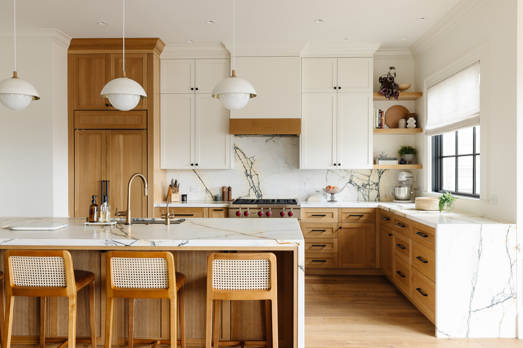
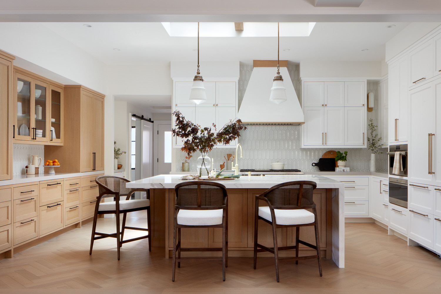
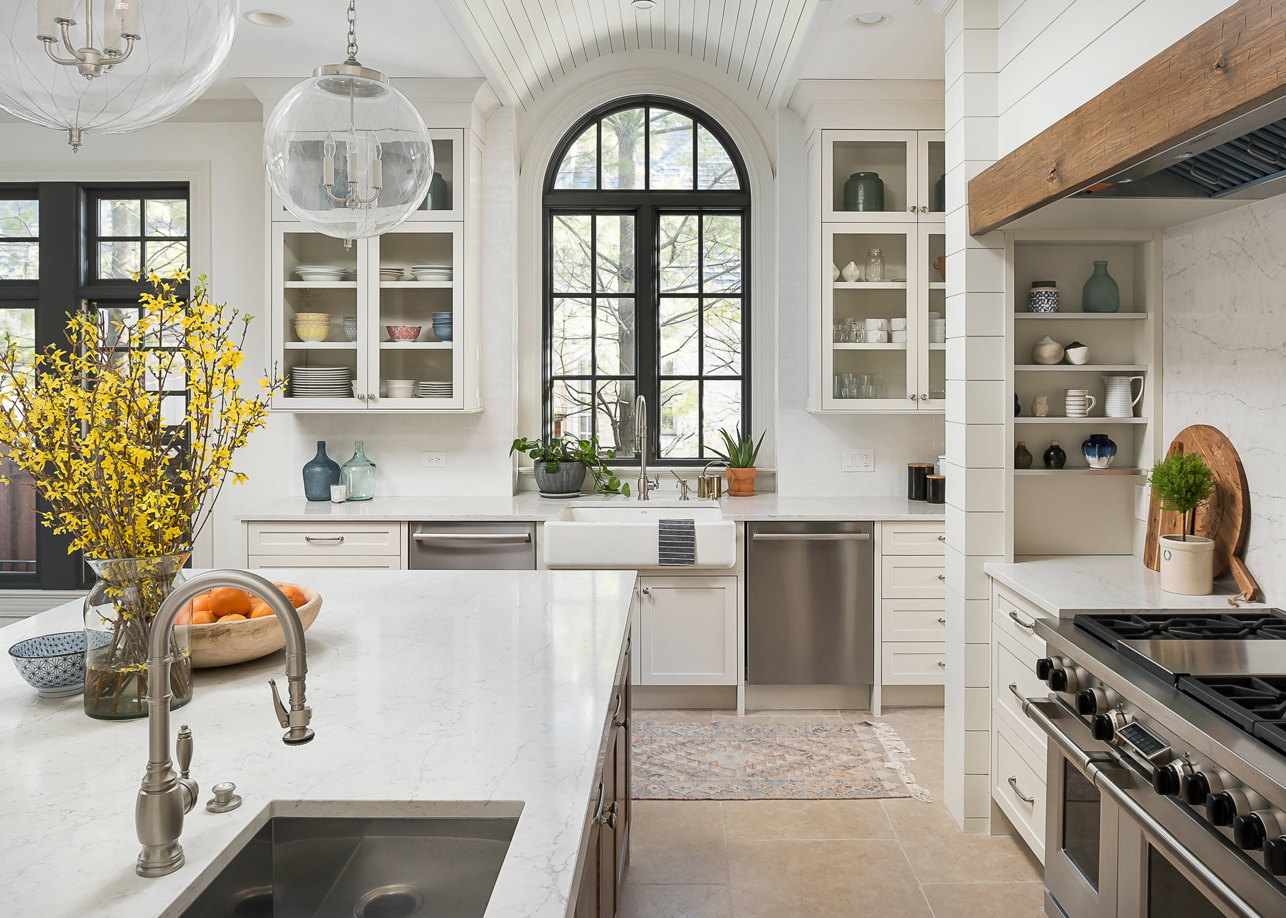
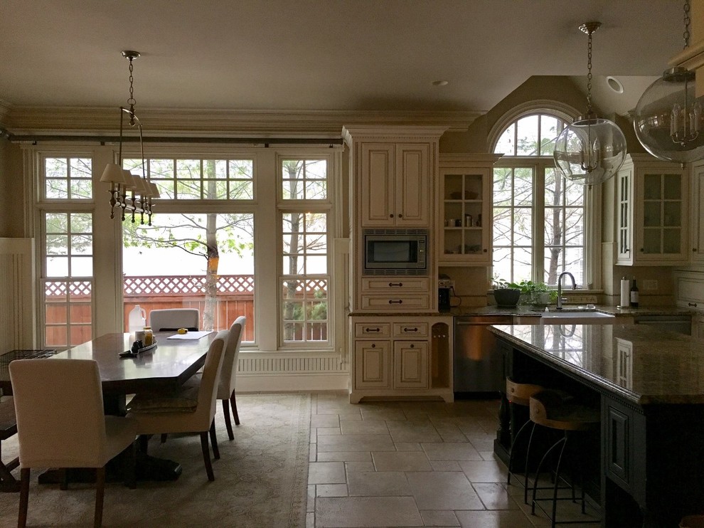
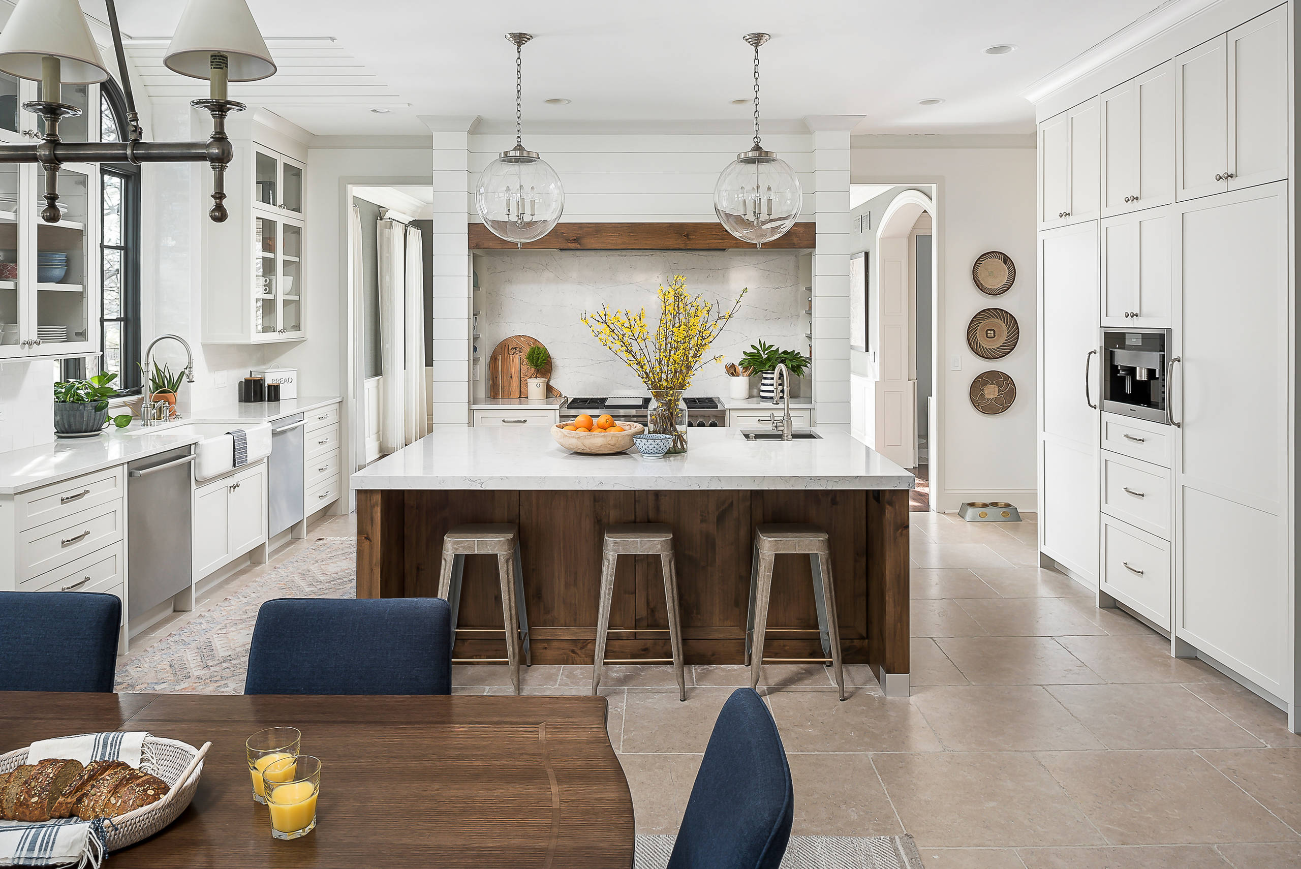
    Features worth keeping. The kitchen’s beautiful windows were one of its best features, but they weren’t being shown at their best. For example, to the left of this arched window was a tower of cabinets that blocked its light, and over it was an awkwardly shaped cutout in the ceiling. “We created a barrel ceiling with a simple narrow shiplap detail to draw the eye up, accentuate the window’s architecture and tie in with the wider shiplap surrounding the range,” Tausk says. A new dark trim paint for the muntins and other window trim millwork accentuates their beauty.

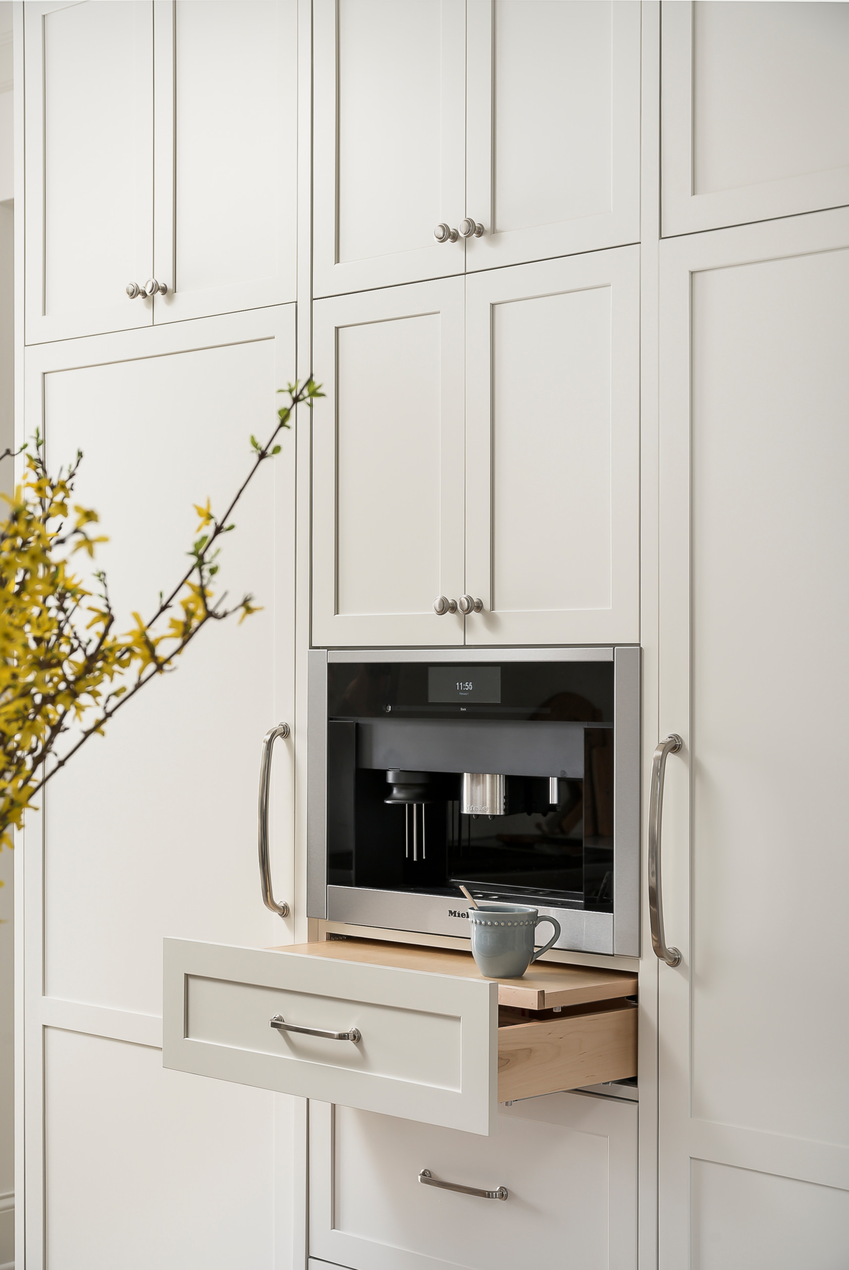
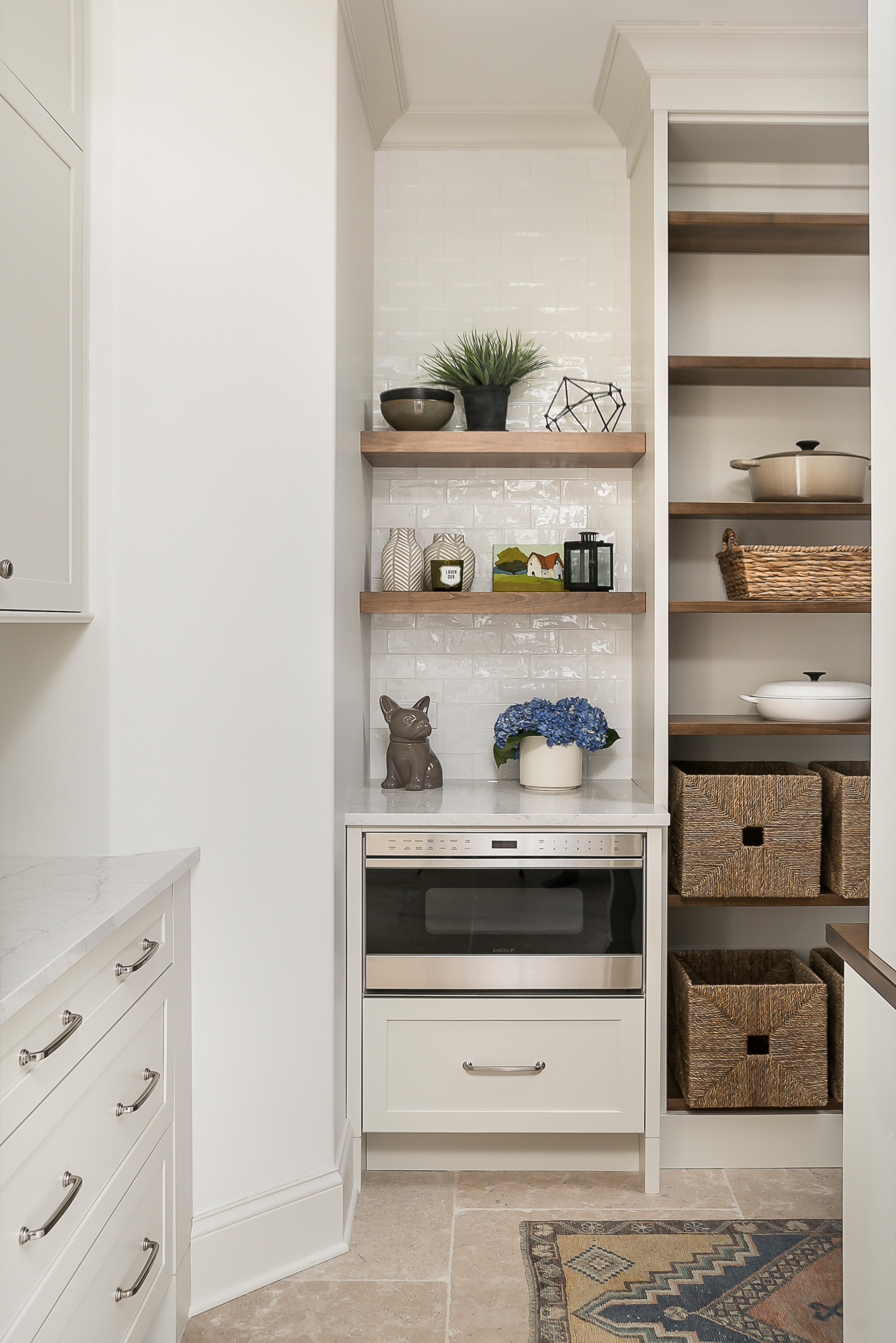
    Layout. A large island anchors the main workspace between a range alcove and the refrigerator. Opposite the fridge is a large sink flanked by two dishwashers. A prep sink in the island is within the work triangle, while the dishwashing sink is flanked by two dishwashers and is close to the cabinets where everyday dishes and china are kept. Past the island is a generously sized eat-in area that overlooks the yard and a porch. A large butler’s pantry area in a new location behind the fridge wall provides space for all the food and a breakfast bar, and a beverage bar replaced the kitchen desk area.
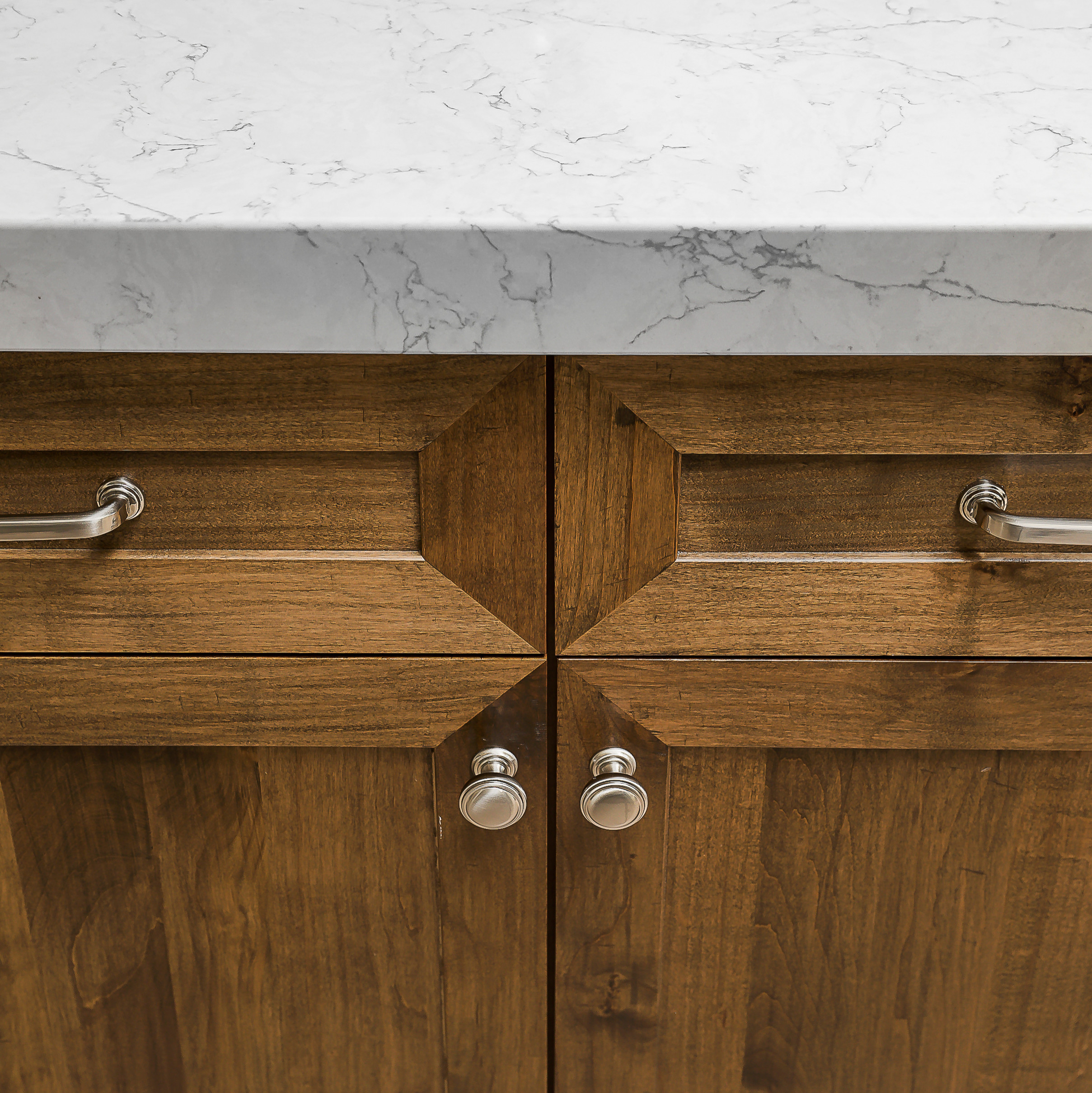
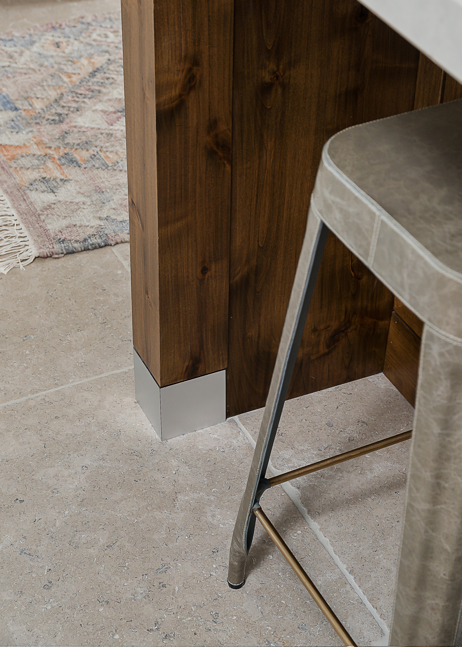
    Island. The island is 94 by 65 inches. Its base is stained alder cabinetry with hand-scraped detailing. It has a chunky quartz countertop that sets it apart from the perimeter countertops. The feet of the end posts have a brushed-nickel finish that matches the cabinet knobs and pulls.

    The island is hardworking: It houses a double garbage pullout, tray dividers for the cutting boards and a drawer outfitted with a knife block. There is another cabinet with rollouts to hold bakeware, and more drawers for storage. The side that faces the refrigerator has storage for the larger stock pots that are too large to fit in the range alcove’s pot and pan drawers.

    Countertops. “Quartz is our favorite for countertops because of its durability and beauty — but not all quartzes are created equal,” Tausk says. “We really looked at a lot of options to find one that had the most natural look with the right amount of movement.” Because they planned to continue the quartz up the range alcove backsplash wall, finding just the right amount of veining and pattern was key.

    Window trim paint: Kendall Charcoal, Benjamin Moore; all cabinets: The Plain & Posh Custom Collection; dishwashers: Bosch; sink: Whitehaven in Sea Salt finish, Kohler; faucets: Model 5200, Waterstone; pendants: Remains Lighting

    Here’s a closer look at the character of the alder wood and the hardware.

    Smaller but important detailing. The island countertop is chunkier than the perimeter countertops: 6 centimeters versus 3 centimeters thick. “The homeowners are both tall and wanted the added height,” says kitchen designer Stephanie Frees, who completed the architectural design and cabinet design. “As these are custom cabinets, the perimeter cabinets were built three centimeters taller than the island so that the end result is the same height overall.” This brought the total height from the floor to the top of the countertops to 37½ inches (standard height for base cabinets plus countertops is 36 inches).

    Counters: Eternal Pearl Jasmine, Silestone; hardware: Tiffany knobs and Bremen pulls, Hardware Resources

    Flooring. Flooring was one of the big questions in the remodel. The existing tiles and grout were difficult to keep looking clean, and the clients didn’t like the color of the hardwoods in the rest of the house, so they rejected the idea of continuing them into the kitchen. In considering tile and stone options, they looked to large-format tiles to give them a less-busy look and fewer grout lines. And getting the color just right was important — “not too gray or cold-looking but not too gold or yellow either,” Tausk says. “We finally hit the jackpot with these beautiful tumbled-limestone floors.” The tiles are 24 by 24 inches.

    This photo also gives us a good look at the brushed-nickel foot detail on the island. The counter stools add leather texture to the material palette.

    Before. The kitchen was cut off from the dining room, except for a zigzag path through a butler’s pantry just out of frame to the right.

    Now two openings on either side of the range alcove lead to the dining room.

    Lighting. You astute Houzzers probably noticed that the light fixtures are the same in the before and after photos. That’s because lighting was the first thing Tausk helped her clients change out before they embarked on the full remodel. Previously there had been a pair of tiny pendants over the island that were out of scale. Now new large glass globe pendants suit the scale without blocking the view through the room too much.

    Wall paint: White Dove; cabinet paint: Classic Gray, both Benjamin Moore

    Refrigerator wall (before). A behemoth of a fridge bulked up this wall, ceremoniously adorned with scrolled columns and crowned with an arch with a medallion and just about every other sort of fanciful overwrought detail you can think of thrown in there.

    Through the arched opening on the right is the hallway to the front of the house, and it served as the main entry into the kitchen before. The kitchen desk area previously mentioned was through the archway on the right.


    Refrigerator wall. The cabinetry along the right side of the kitchen includes a panel-front Sub-Zero refrigerator and freezer that blend right in. There is a pullout coffee station between them.

    Cabinet paint: Classic Gray, Benjamin Moore; coffee system: Miele; column refrigerator and freezer: Sub-Zero


    Range alcove. The range alcove remained in about the same place, but now it has a simplified look marked by a mix of lovely textures — shiplap, quartz and a distressed beam mantel. And now it’s flanked by the two openings to the dining room. The range is 48 inches wide and has six burners, a griddle and two ovens.

    The designers walked the homeowners through several different options before landing on this design, including a decorative cement-tile backsplash and a stone to tie in with the stone fireplace in their family room. “Ultimately, these options started feeling like too much — we liked the simplicity of the quartz backsplash and brightness and clean lines of white shiplap,” Tausk says. “The reclaimed wood beam was our way of bringing in the warmth, color and texture we wanted.”

    There are spice shelves tucked into each end of the alcove. The top drawers in the alcove’s cabinets have inserts for all of the cooking utensils while the drawers below hold the pots and pans.

    Shiplap and wall paint: White Dove, Benjamin Moore; backsplash and counter: Pearl Jasmine, Silestone; 48” range, Wolf


    Here you can get a better look at the spice rack and a peek into the breakfast bar portion of the butler’s pantry.

    And here you can see how the room now enjoys the view into the dining room and the sunlight that floods it. African baskets add texture to the wall.


    Eat-in area. The large family gathers for almost all of their meals in this comfortable and bright spot. The homeowners already had the table, which the designers had refinished to look like new. “We purchased new upholstered chairs in a navy color so that they would be both comfortable and easy to maintain,” Tausk says. A new chandelier over the table has traditional detailing but a more modern linear silhouette.

    Dining chairs: Arhaus; E.F. Chapman Classic Linear Chandelier, Visual Comfort; browse linear chandeliers


    There is a reconfigured butler’s pantry behind the refrigerator wall. There is access from both sides — through the opening on the right there is a beverage bar; through the opening on the left there is a breakfast bar and lunch-making area.

    Kids’ breakfast and lunch-making bar. “This area was custom-designed to house all of the items needed for the kids to get their breakfasts and pack their lunches,” Frees says. The cabinet on the left has a bread drawer in it and all of the lunchware and water bottles are stored in the drawers below it. The counter above it is for the Keurig (for hot chocolate and tea) and a toaster, and the adjacent wall holds a microwave drawer. The baskets hold all of the snack foods.

    Subway tile: Masia, Soho Studio; microwave drawer: Wolf


    Once you walk past the breakfast bar and turn right, you enter the food storage pantry. At the other end of the pantry is a hallway to the kitchen from the front of the house — custom doors with fluted-glass inserts introduce the alder wood seen throughout the kitchen to those about to enter the room.


    Beverage bar (before). That clutter magnet of a kitchen desk mentioned earlier used to mark the main entry into the kitchen

    Beverage bar. The desk has been replaced with a beautiful beverage bar. “Because the main kitchen area is more neutral, we decided to have a little fun with color in the bar area,” Tausk says. Everyone fell hard for the combination of soft blue, a knotty alder wood backsplash and brass hardware, and it provides a prettier journey from the front of the house into the kitchen. As you can see here, the pantry doors echo not only the alder wood but also the brass hardware.

    Cabinet paint: Solitude, Benjamin Moore; lighting and cabinet hardware: Rejuvenation


    There is a beverage fridge on the left and a wine fridge on the right.

    Beverage and wine refrigerators: U-Line.


    Floor plan. Here you can see the way the pantry is laid out along the bottom of this plan. The dining room is behind the range wall.

    I know this beautiful kitchen’s size and budget are beyond reach for most of us, but there are plenty of ideas to steal from it.

    Takeaways

    • If you’re tired of all white in the kitchen but still love a light look, take a handful of baby steps away from it — using a light gray on the cabinets, mixing in wood details, choosing a different color or wood for an island base or painting window trim a contrasting color.
    • You’re not likely to know exactly what you want right away. Take the time to walk through different options and looks. For example, looking at options they initially thought they wanted for the range alcove made this family realize they didn’t want it to look too busy or too heavy, and they landed on just the right look.
    • Consider cleaning when choosing a floor tile and grout, especially in a high-traffic, high-spillage-potential area like a kitchen.
    • Think about every single thing you want to grab when you are prepping, cooking and cleaning and arrange for convenient storage within reach of those areas.
    • Got four kids? Get dark or wipable upholstery on the kitchen chairs.
    • Think about ways you can set up stations to keep people out of the way of the cook.
    • The easier you make it for your kids to grab their own breakfasts and pack their own lunches, the easier your mornings will be.
    • If you are getting rid of items like cabinets, lighting or a sink that simply don’t suit your style but are in good condition, there are plenty of resources for donating them for reuse. Check out How to Donate or Recycle Home Remodeling Materials for more information.
  • Before and After: 4 Fresh White-and-Wood Kitchens

    A two-toned palette sounds limited? These four kitchens beg to differ. With the wide range of wood tones, stains and grain styles on offer, as well as all the shades of white and various products and materials available in both colors, the possibilities really are limitless. The designers here went with farmhouse, traditional and midcentury styles, but any style is a good candidate for this classic palette. See for yourself below, then show us your own white-and-wood kitchen in the Comments.


    “After” photos by Valerie Wilcox

    1. Bright Farmhouse

    Kitchen at a Glance
    Who lives here: 
    A couple
    Location: Midhurst, Ontario
    Size: 252 square feet (23 square meters); 21 by 12 feet
    Designer: Aniko Nicholson Design

    Before: These Canadian homeowners loved wood finishes, but too much of one type of it — an orange-red cherry on the cabinets and flooring — made their kitchen feel busy and hemmed in despite the open-plan concept. They brought on interior designer Aniko Nicholson to approach the wood and the layout more strategically, and to create a better lighting plan and a focal point.


    After: The charming new farmhouse-inspired design balances soft medium-tone white oak (including on the island base and paneled fridge), reclaimed barn beams (including over the range) and warm white finishes (including a shiplap-clad ceiling as well as cabinets painted in Benjamin Moore’s Swiss Coffee). Bright copper pendant lights enliven the look.

    Nicholson also reconfigured the layout and some core elements. A floor-to-ceiling cabinet has taken the place of a jutting-out pantry, allowing for better flow and a longer island. Hefty bulkheads by the window are gone. And a wider opening on one side means the kitchen now has lovely views through the living room window, and the living room has better light.

    Nicholson centered the range alcove on the new island and created this focal point backsplash. It and the island top are composed of a richly textured sintered stone surface called Dekton Arga XGloss.


    “After” photos by Spacecrafting

    2. New Take on Traditional

    Kitchen at a Glance
    Who lives here: Bill and Mary Maney and their Labrador retriever
    Location: Maple Grove, Minnesota
    Size: 275 square feet (26 square meters)
    Designer: Mary Maney of Crystal Kitchen + Bath

    Before: An abundance of honey-toned cabinets and a similar flooring gave this suburban Minnesota kitchen a bland look. It also had a crowded feel, due to low-hanging cabinets, cluttered countertops, a flow-impeding fridge and a plethora of items atop the upper cabinets. Homeowner Mary Maney, who happens to be an interior designer, got to work transforming the kitchen into a bright and inviting gathering place with a traditional feel.


    After: Knocking the kitchen back to the studs allowed Maney to bring in new everything, including windows, and to switch up the layout a bit for better circulation. The fridge, now paneled, is now on the oven wall, and a cooktop on the back wall has replaced an electric cooktop in the island.

    A walnut vent hood over the cooktop makes a statement, set off by generous amounts of white and beige. The cabinets now reach the ceiling for a more streamlined look, while wide-plank engineered white oak flooring grounds the room. A glass-front storage tower with interior lighting and walnut paneling turns dishware into decor.

    Wall paint: Accessible Beige, Sherwin-Williams; trim paint: Super White, Benjamin Moore

    See why you should hire a professional who uses Houzz Pro software

    Here’s a closer look at the walnut statement hood, which matches the island base, and at the eye-catching backsplash, which is composed of mosaic Calacatta marble tiles with brass, surrounded by 3-by-12-inch honed marble tiles.


    “After” photos by Provoke Studios

    3. Tidy Galley

    Kitchen at a Glance
    Who lives here: A couple, their four kids, two dogs and cat
    Location: West Vancouver, British Columbia
    Size: 117 square feet (11 square meters)
    Designer: Lori Steeves of Simply Home Decorating

    Before: At the back of a compact home in the Canadian province of British Columbia, this galley kitchen didn’t serve the homeowners and their four children well. With only 117 square feet to work with, designer Lori Steeves came on board to improve the storage, flow and look while keeping to the home’s midcentury design.


    After: Steeves nixed the island, which housed the sink and an air vent, in favor of a peninsula with seating. She moved the sink under a newly placed window and scooched the fridge and range to the right to make room for a pantry cabinet. The clean lines and two-toned palette — white oak-look cabinetry and bright white — streamline the look.

    Browse counter stools in the Houzz Shop


    Moving the window allowed the designer to extend the upper cabinets, and she also used pullouts, deep drawers and a lazy Susan to make the most of the storage space. Two other space-maximizing tricks: grooves instead of hardware on some of the cabinets, and LED lights on the bottom of the upper cabinets instead of ceiling fixtures.

    4. Making Connections

    Kitchen of the Week
    Who lives here: A couple with two kids in middle school
    Location: Melrose, Massachusetts
    Size: 365 square feet (34 square meters)
    Design team: Amy Tangorra (lead designer), Alex Scovell (space planning) and Paige Lewin (finish selections) of Our House Design+Build

    Before: Disconnected from the breakfast bar and not in keeping with the homeowners’ love of nature and midcentury style, this New England kitchen was ready for a makeover — one that would include a bigger island to accommodate all four family members. The homeowners tapped a team with Amy Tangorra as the lead designer for the makeover.

    After: Removing the wall opened up the kitchen to the breakfast area and made room for a bigger island. Note how the same white oak flooring spans the two spaces for a cohesive look, yet each area feels distinct.

    Cotton-white walls, off-white backsplash tiles and white quartz countertops create a fresh counterpoint for custom-stained red birch cabinetry and a matching vent hood. Low-back wood stools fit the palette and midcentury vibe beautifully. The interior side of the island houses a microwave drawer and more storage, and open wood shelves to the left of the window (not seen) hold display items and everyday dishware.

    Wall and trim paint: Chantilly Lace, Benjamin Moore; backsplash tile: Halite, Fireclay; counters: Delgatie, Cambria; vent hood: Stanisci Design & Manufacturing

  • The 10 Most Popular New Bathrooms Right Now

    This Trending Now story features the most-saved bathroom photos uploaded to Houzz between June 15 and Sept. 15, 2025.

    A standout bathroom balances a functional layout with materials and details that make daily life easier. For fresh inspiration, check out this countdown of the most-saved new bathroom photos on Houzz.

    10. Straight and Narrow

    Lomax & Chi designed a London townhouse’s narrow en suite bathroom to feel more spacious with a large mirror, tall window and wall-hung toilet. Enhancing the effect, a single floor color stretches from the main bathroom into the shower area, interrupted only by a slim curb. Vertically stacked celadon tile creates a stunning shower wall, and a heated towel rack and rain shower head provide posh finishing touches.


    9. Watercolor Effect

    In this Boston bathroom by Fresh Start Contracting, vertically stacked rectangular wall tiles in varied shades of seafoam green stretch to the ceiling and down to a shower floor that looks a bit like a sandy beach. Brass accents and a spacious double vanity in a rich wood finish warm up the cool, water-colored walls.


    8. Field of Flowers

    Kiley Wilfong Cullen of Ven Studio Architects designed this wet-room area in a Vienna, Virginia, bathroom with a luxurious freestanding soaking tub, two handheld shower heads, a large built-in bench and bold floral floor tile. A neutral large-format porcelain tile covers both the wet-room walls and the bathroom floor to make the two spaces feel cohesive. Notice the frosted band on the glass shower enclosure, which provides privacy while letting in light.


    7. Playful Mix

    Velvety matte glass black-and-white pinwheel floor tile sets the tone for this El Cerrito, California, bathroom by Sogno Design Group. Bright turquoise rectangular tiles, stacked in a vertical offset layout, form wainscoting behind the wall-hung white oak vanity and continue into the shower, where they meet vertical white subway tile. A thin black trim visually connects the various tiles and ties in the fun floral wallpaper seen in the water closet on the left.


    6. Mediterranean Mood

    Kelly Lord Designs and AMI Build transformed a Mount Juliet, Tennessee, home with a whole-house renovation that included this modern Mediterranean-style bathroom. Two-tone honed cement tile in a star-and-cross pattern covers the floor, meeting a polished yet similarly handmade-looking wall tile inside the spacious, glass-enclosed wet-room area. A niche built into the corner has plenty of space for bath products as well as water-loving plants.


    5. Marble Immersion

    Classical and modern elements mingle in this elegant and airy Dallas bathroom designed by Jessica Koltun Home. The room’s focal point is a drop-in tub that sits beneath a large arched window, flanked by matching custom white oak vanities. The mitered vanity tops and the tub’s blocky surround are made of Calacatta Gold marble, which also covers the floor, crosses into the zero-threshold shower and travels up the shower walls.


    4. Niche Expertise

    Thoughtful accessibility features were integrated into this Lexington, South Carolina, primary bathroom, including a handheld shower, built-in bench and grab bar. Uploaded by Interior Solutions, the space also incorporates deft aesthetic touches, such as a mix of metals for depth and a dark blue vanity that coordinates with the multihued blue penny tile on the shower floor and niche.


    3. Coastal Calm

    In a custom Wilmington, North Carolina, home by
    Konrady & Son Construction, this bathroom features a curbless shower with a floor-to-ceiling glass entrance that hints at a steam setup. Soft blues, sandy tans and frothy whites nod to the coastal setting, while the vanity’s thick marbled countertop grounds the room’s light, airy palette.


    2. Neutral and Natural

    Dani Bradshaw and Lynn Siemer of Blythe Interiors transformed this Encinitas, California, bathroom into an organic modern retreat, full of natural materials, layered textures and warm neutral colors. The shower’s pebble floor and slat wall tile, along with the vanity’s zellige tile backsplash, enhance the zen-like quality that the homeowners craved. Meanwhile, the vanity’s half-moon hardware and skinny Shaker doors add fresh, contemporary touches.


    1. Fresh Take

    A corridor layout of simple creamy rectangular tiles adds subtle but substantial style to this shower in a pretty Edina, Minnesota, bathroom by construction2style. A stacked duo of niches — one arched and one rectangular — as well as antique brass fixtures and leafy accents lend additional flair to the small space.